대한민국 한글 홍보 캐릭터 디자인 프로젝트
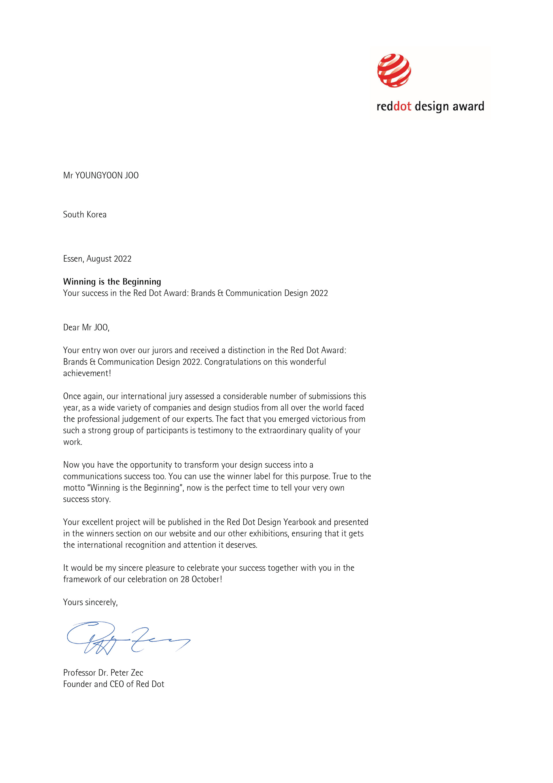
Red Dot Design Award Brands & Communication Design, Winner
The 56th Korea International Design Award, Silver Prize
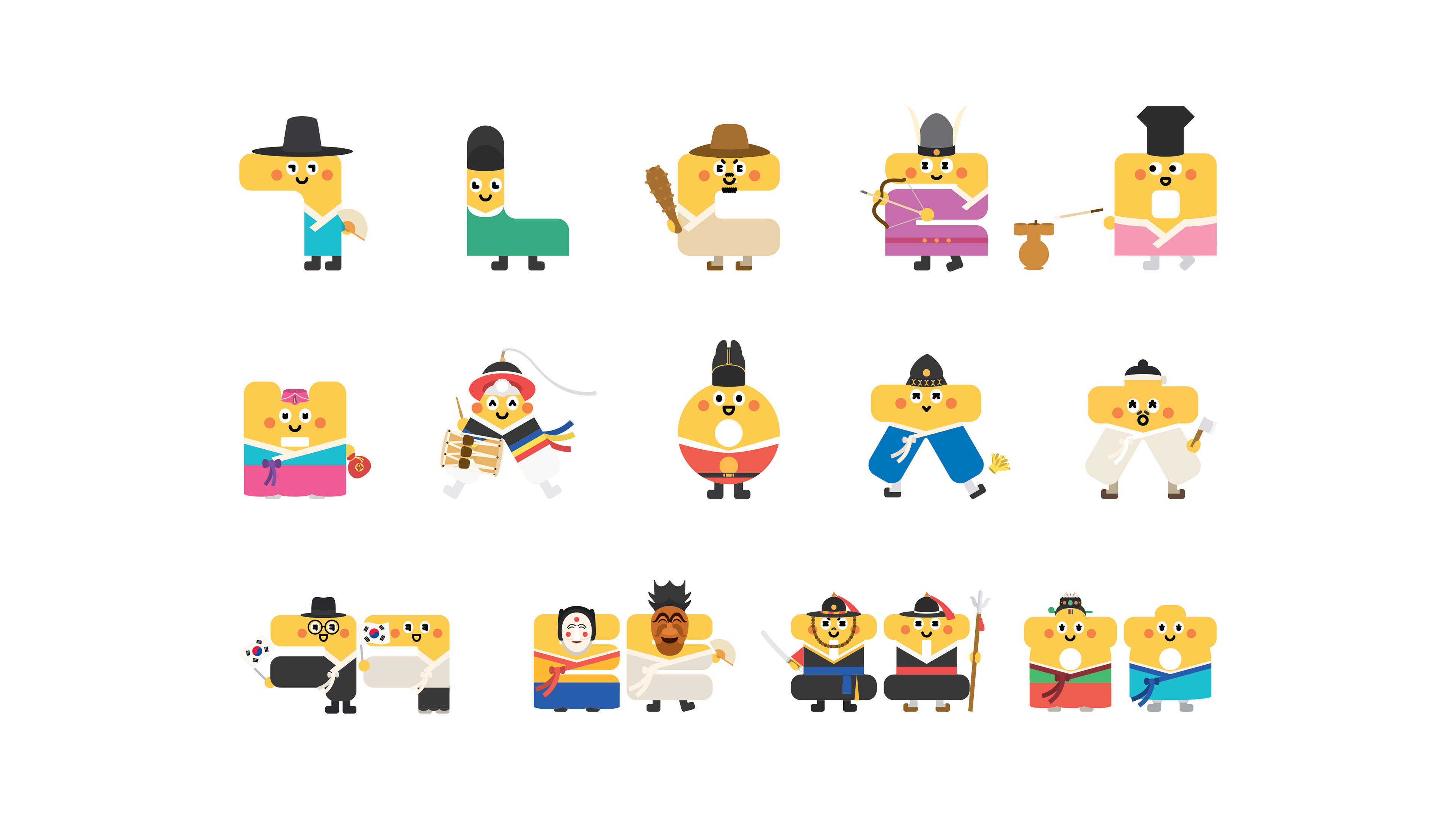
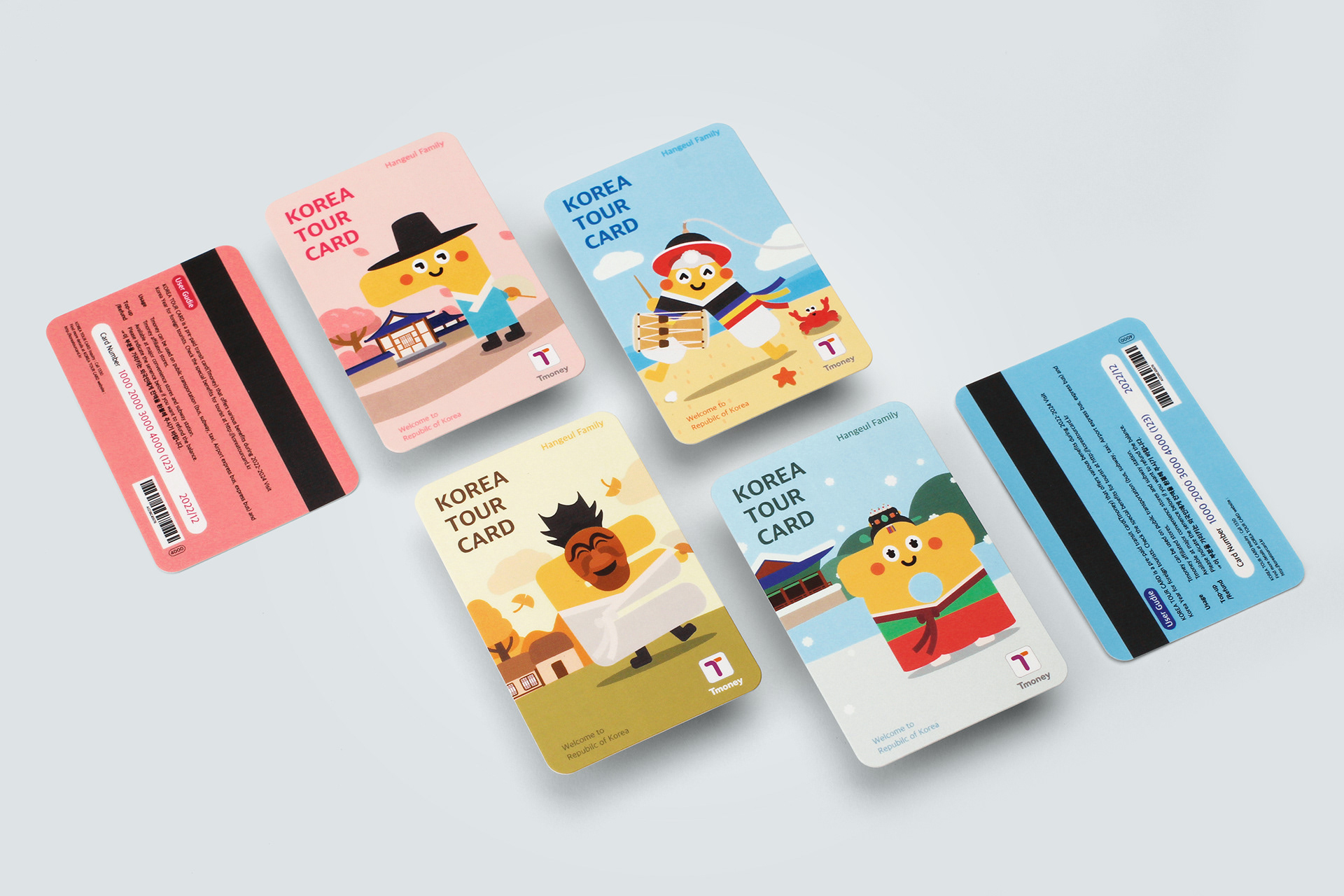
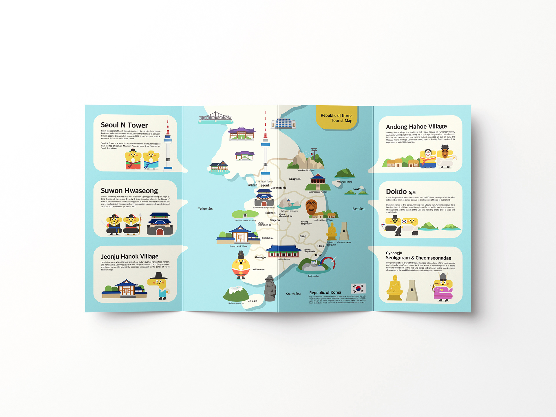
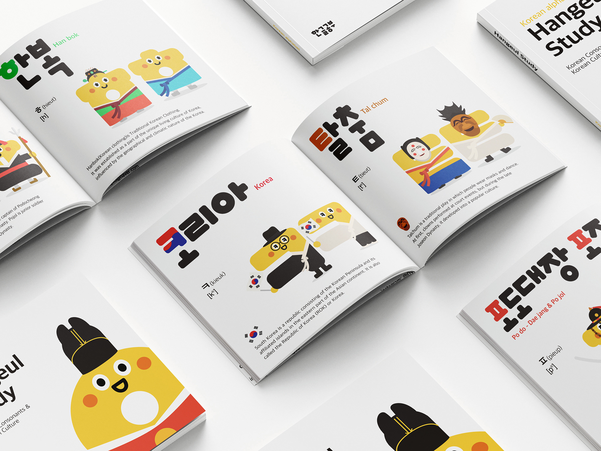
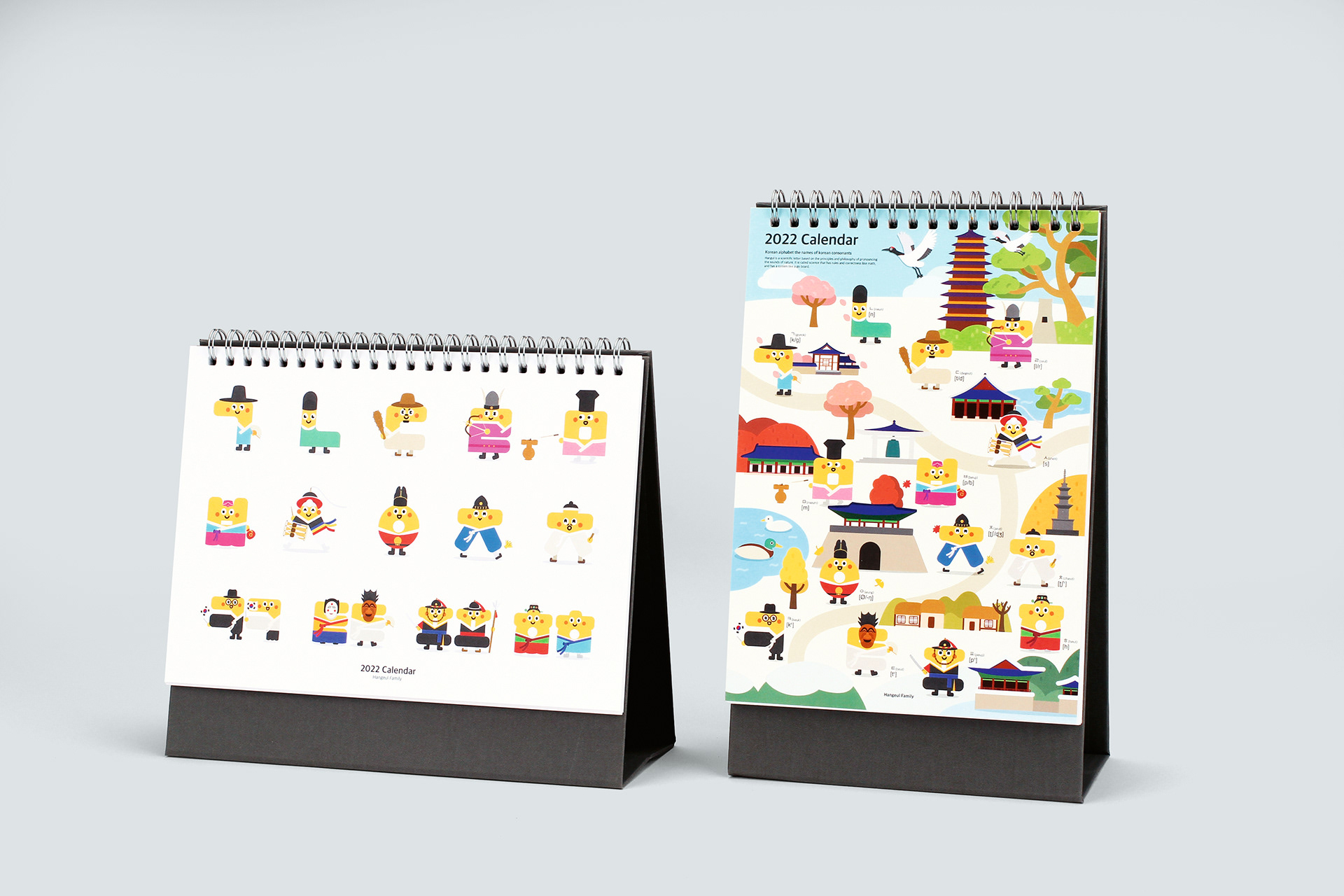
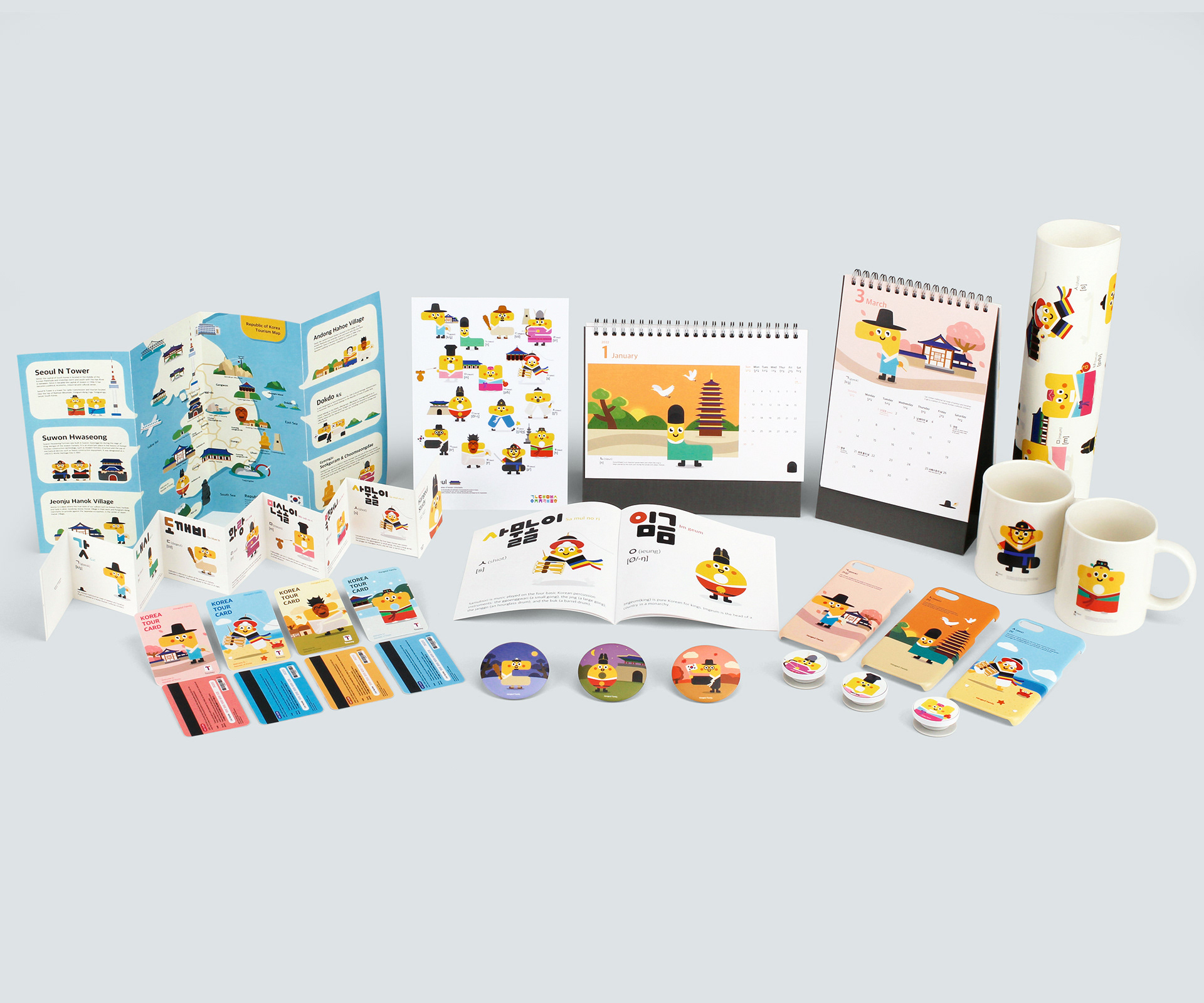
최근 K-POP, K-DRAMA 등 K-콘텐츠의 세계화로 ‘한글’의 관심도가 높아지면서 한글을 배우려는 외국인들이 늘어나고 있습니다. 이에 외국인과 외국인 관광객들에게 ‘한글’과 ‘한국의 문화’를 알리고자 한국 문화와 접목시킨 한글 홍보 캐릭터 ’Hangeul Family’를 개발합니다.
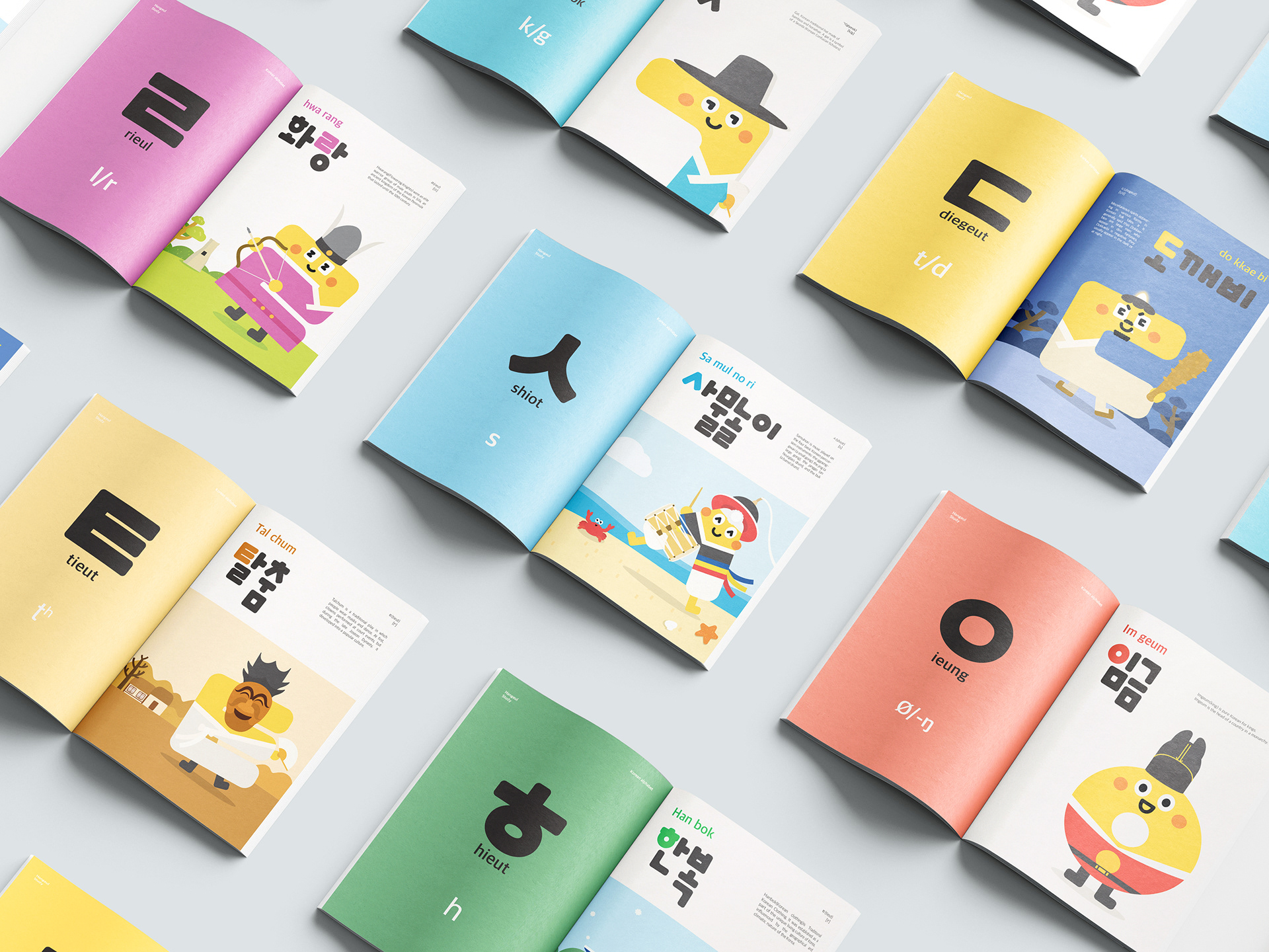
’Hangeul Family’는 14개의 한글 자음과 한국 문화를 결합하여 외국인 및 관광객에게 한글의 생김새, 발음, 영문 표기법 등을 친근하게 알리고 쉽게 배울 수 있도록 하였으며 한글의 형태 및 특징, 그리고 한국 문화 이미지가 잘 인지되도록 제작합니다.
Recently, as the globalization of K-contents such as K-POP and K-DRAMA has been increasing interest in "Hangeul," a growing number of foreigners are trying to learn Hangeul. In order to promote "Hangeul" and "Korean culture" to foreigners, the Korean promotional character "Hangeul Family", the Korean promotional character was designed, which was combined with Korean culture.
"Hangeul Family" combines 14 Korean consonants and Korean culture to inform foreigners of theappearance, pronunciation, and English notation in a friendly manner, and designed to help them recognize the shape, characteristics, and Korean culture image.
Director & Designer: Youngyoon Joo